The art of FBFO: part two
Every month, the For Bond Fans Only Facebook group asks members to vote for a Bond-related topic/theme to celebrate and discuss in depth. For instance, FBFO may shine the spotlight on one of the actors, or a specific film in the series, a character or a novel/short story, etc.
Anything is up for suggestion, by any member... but there is a twist. You see, FBFO has an affectionate streak of sardonic humour running throughout it, very much like Bond himself, so there is only one caveat: all suggestions have to be pun-tastic! This is demonstrated by the gems (and groaners) below.
Since late 2016, I've been asked to produce the artwork banner images for these monthly, pun-embracing, celebrations. Collated below are my designs for the twelve months of 2018. Enjoy.
January 2018: "Hamuary"
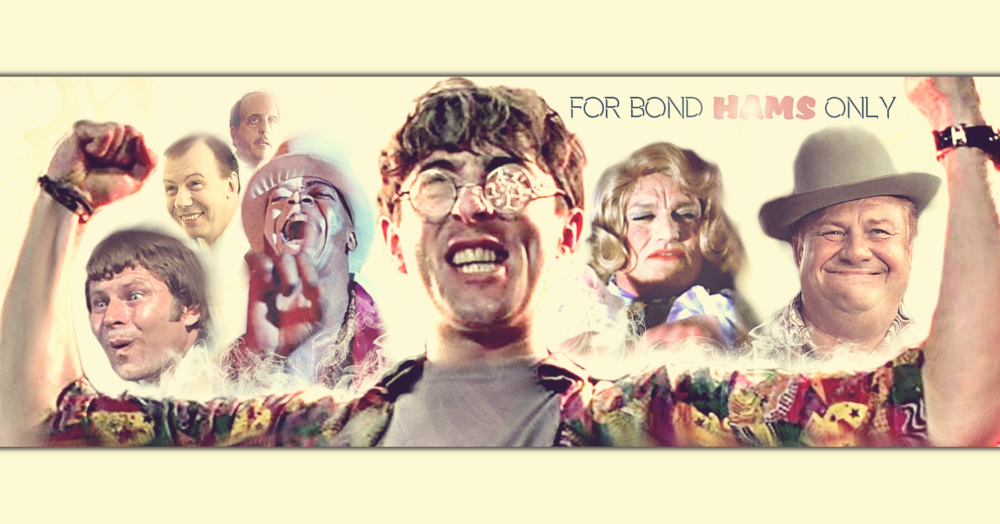
Theme: a whimsical look at the hammy actors (and eccentric characters) in James Bond films. The moment I was asked to provide an image celebrating the more OTT of Bond performances, I immediately pictured Boris and his ludicrous "I am invincible" pose. This became the centre-piece to the image, with my favourite campy characters hoisted on his shoulders.
February 2018: "FebruHarry"
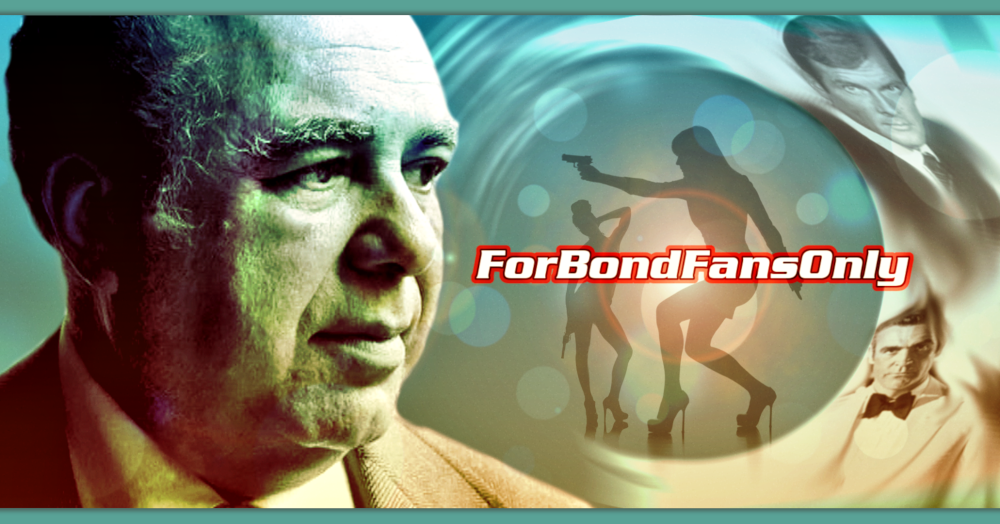
Theme: an appreciation of the late, great Harry Saltzman. I wanted to create an image that felt as though it had been captured from a real Bond title sequence, and one that featured great Bond producer himself.
March 2018: "Stacey March"
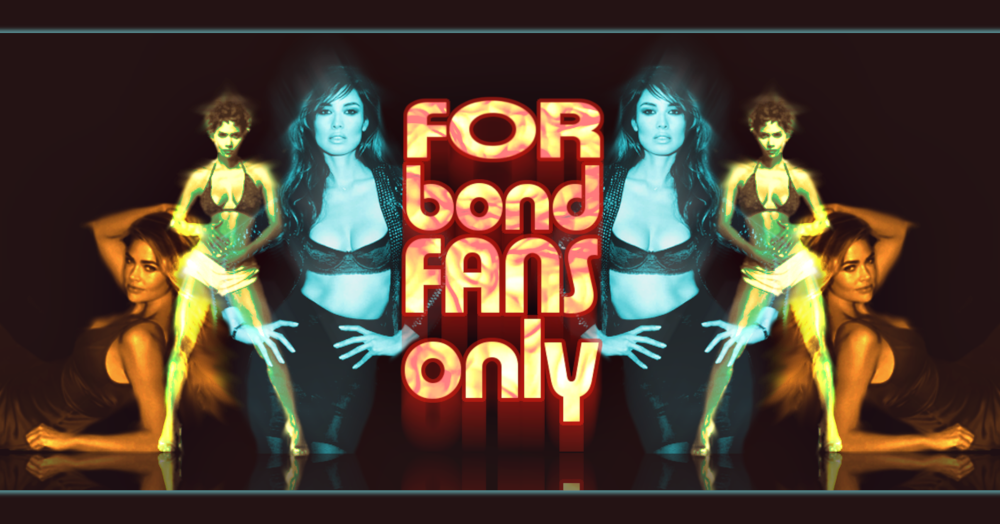
Theme: the beautiful and glamorous Bond Girls and the talented women who portrayed them. In memory of the late Stacey Marsh who is missed by many on For Bond Fans Only. His fondness for posting photos of gorgeous Bond actresses on the pages of FBFO lead to this worthy memorial month to our friend.
April 2018: "Apkill"
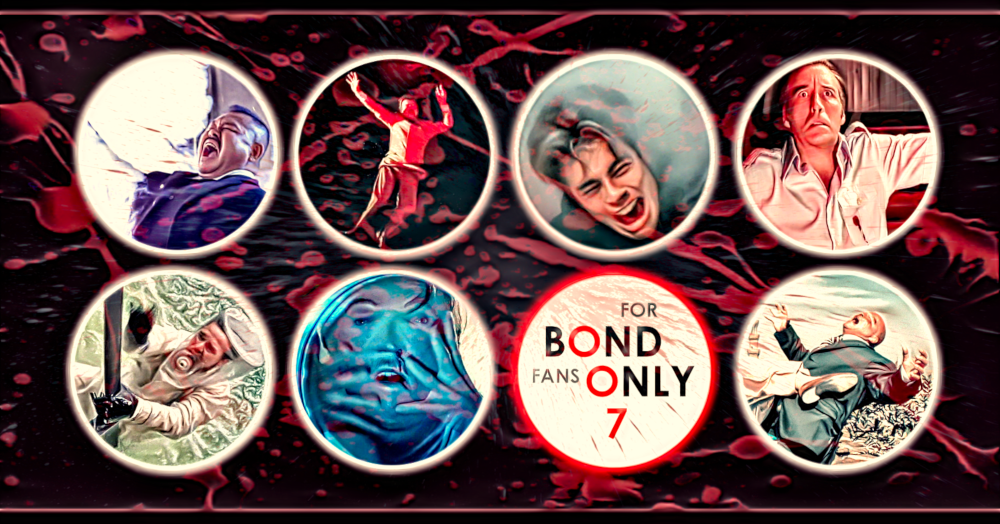
Theme: the inventive and spectacular kills of Bond films. A collage of some of the most memorable kills (in my opinion) from the film series in a design inspired by Maurice Binder's minimalist graphic dots from Dr No, and splattered with a liberal dose of the red stuff.
May 2018: "FleMayng"
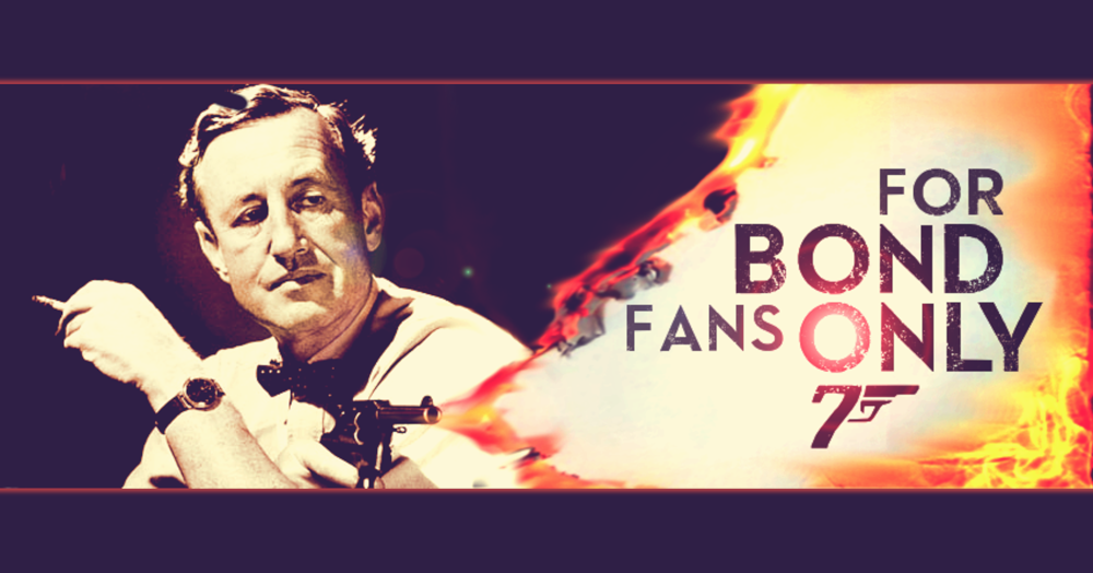
Theme: in what would have been his birthday month, an appreciation of the man who created a literary icon: Ian Fleming. Incidentally, this was the first-ever banner design I created for FBFO, sometime late in 2016. I just posted it as a bit of fan-art on the page, and it received some nice, positive feedback. Over a year later, when Fleming became the worthy recipient of his own month on FBFO, it made total sense to re-use this design. It's still one of my favourites.
June 2018: "Goon"
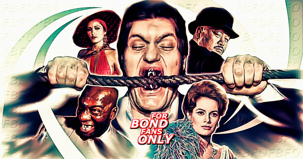
Theme: a celebration of all the henchmen/woman and "goons" in Bond. Jaws had to be the centre-piece to this image; is there a more iconic henchman in all of cinema? I wanted to create a banner with a strong graphic design, inspired by the spiralling of Binder's iconic gun barrel design. I like the symmetry of this piece, and the nice subtle FBFO wallpapering.
July 2018: "For Your JulEyes Only"
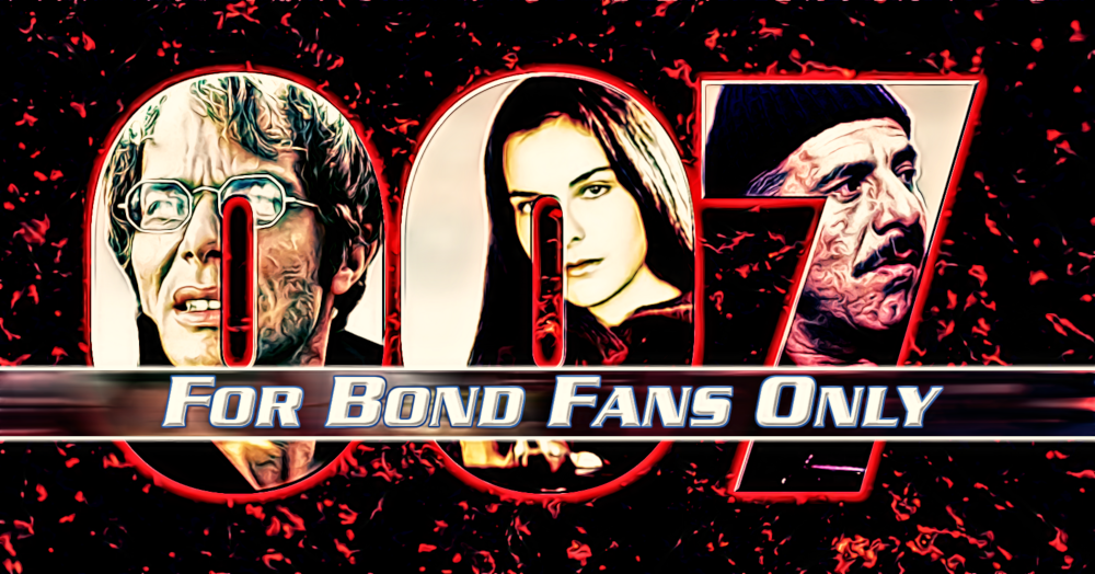
Theme: a month dedicated to the film For Your Eyes Only. Sometimes you start on a design, and everything just clicks into place sweetly. Other times, you struggle to find inspiration. This is one of the latter occasions: I look at this and cringe! While I'm glad I focused on my three favourite characters from the film (excluding Bond himself), I do wish I'd spent more time crafting a more interesting collage. This is my least favourite banner, one I wish I could re-do.
August 2018: "AugAston Martin"
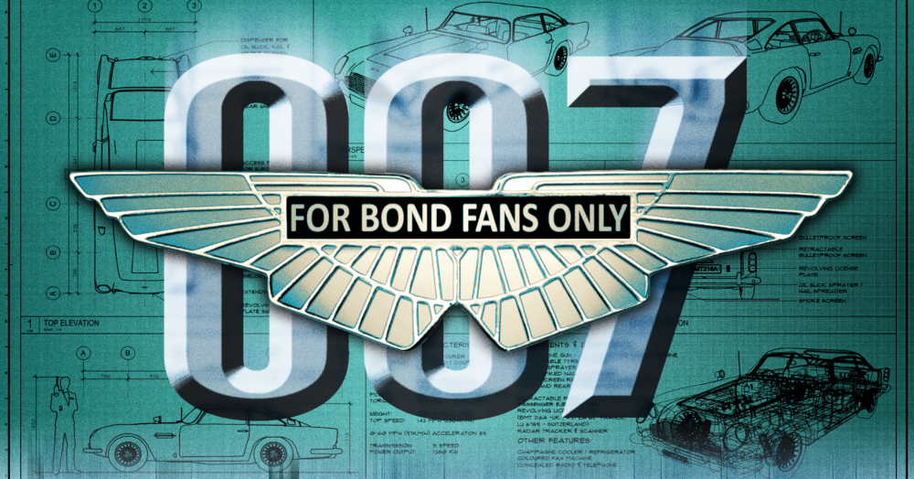
Theme: celebrating Bond's carmaker of choice: Aston Martin. Having been sorely disappointed with my design the previous month, I was determined to up-my-game for this piece. After all, the Aston Martin is such an elegant part of the Bond mythos. And the spark of inspiration came from Aston Martin's emblem. This design just fell into place beautifully and is one of my favourites.
September 2018: "Sleptember"
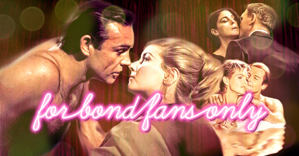
Theme: highlighting Bond as a lover, not as a fighter. Hmm, being asked to design a banner around Bond's bedroom antics was certainly a puzzler. How to do so without being icky? Well, my answer was to embrace the tackiness! Pink neon signs, a red velvet backdrop, and some Bond-on-beauties action created the tawdry air of a Soho peepshow (PG13 version, that is!).
October 2018: "Rocktober"
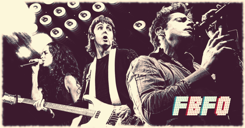
Theme: kick-ass Bond theme songs and the rockers responsible. I wanted to create a Bond mega rock group, and I wanted my banner design to be a photograph captured during a raucous stage performance of theirs. We're in the mosh-pit looking up at a killer encore.
November 2018: "Snowvember"
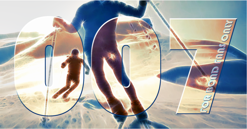
Theme: a month dedicated to snow-based Bond scenes. When you think of Bond and snow you immediately think of On Her Majesty's Secret Service, so that had to be the basis for this image. It's a strikingly simple image: two graceful black silhouettes on white/blue snow - and leant itself perfectly to abstraction. I wanted to create the sensation of the sun sparkling off the snow directly into your eyes, enhancing the sense of speed and movement of the piece.
December 2018: "Desember"
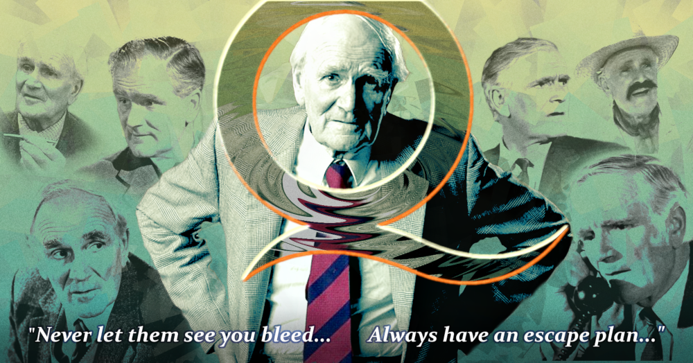
Theme: a fond celebration of a Bond Icon: Desmond "Q" Llewelyn. How do you pay adequate homage to one of the most beloved actors of the series? For me, the final words Desmond spoke as Q seemed like a necessary flourish.
